← All work
02 · Sound app · Personal project · 2025 → 2026

Tranquil Soundwaves

My first app, made for myself as a white noise listener. Refreshed with AI a year later. Same identity, now a finished product.

Role
Product designer2025 solo, 2026 with AI
Built with
Figma, Adobe Photoshop and Illustrator in 2025Claude in 2026
Platform
iOS and Android
Status
Working prototype, tested

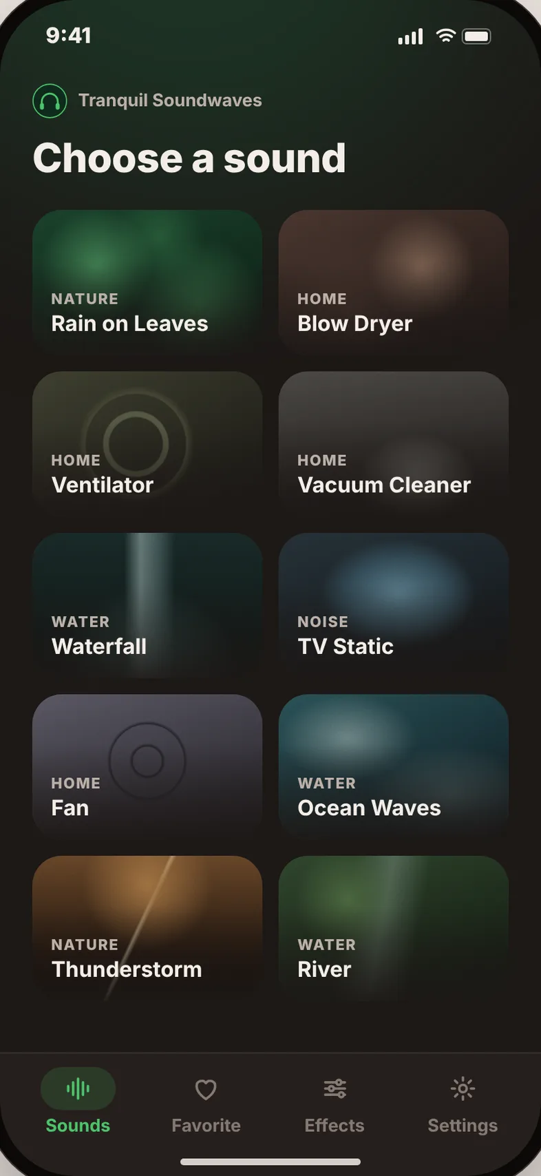
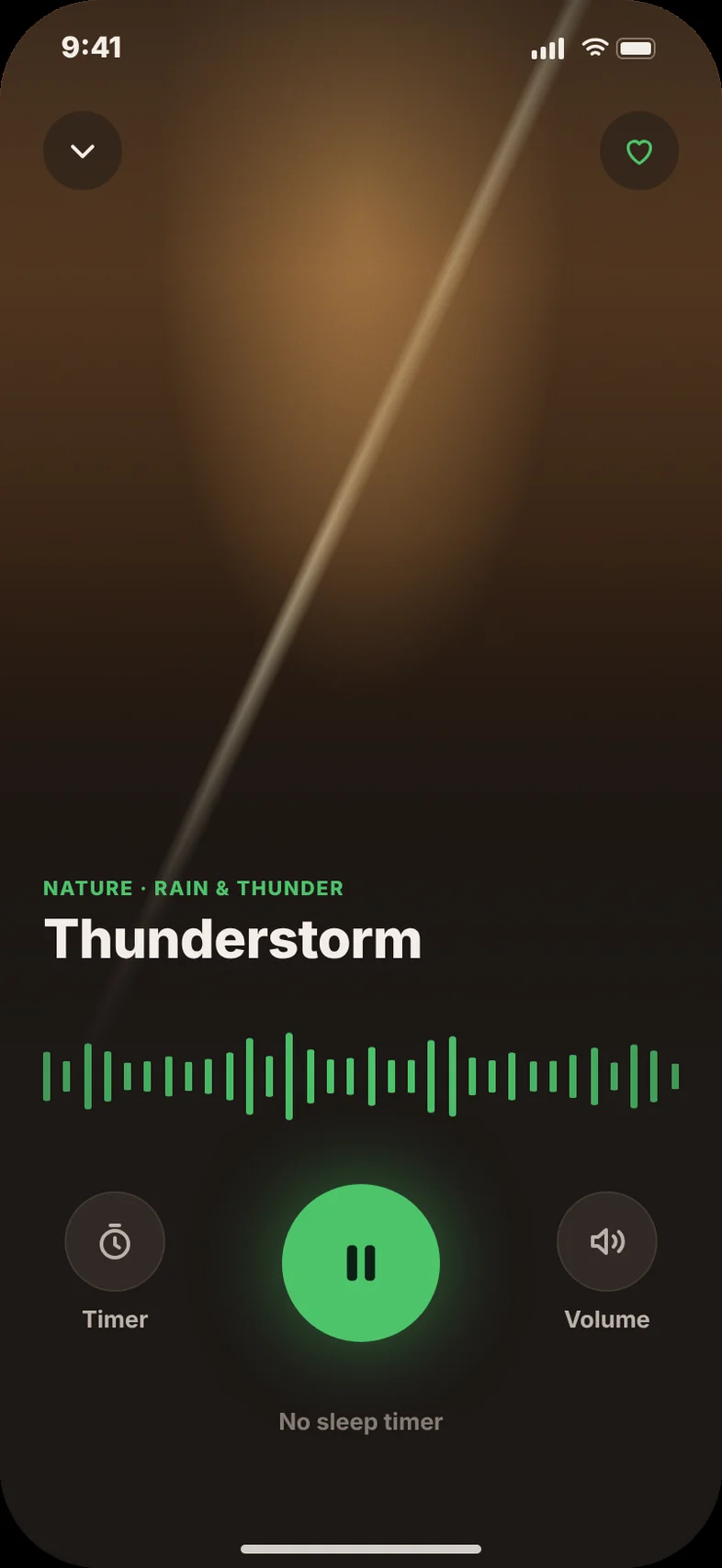
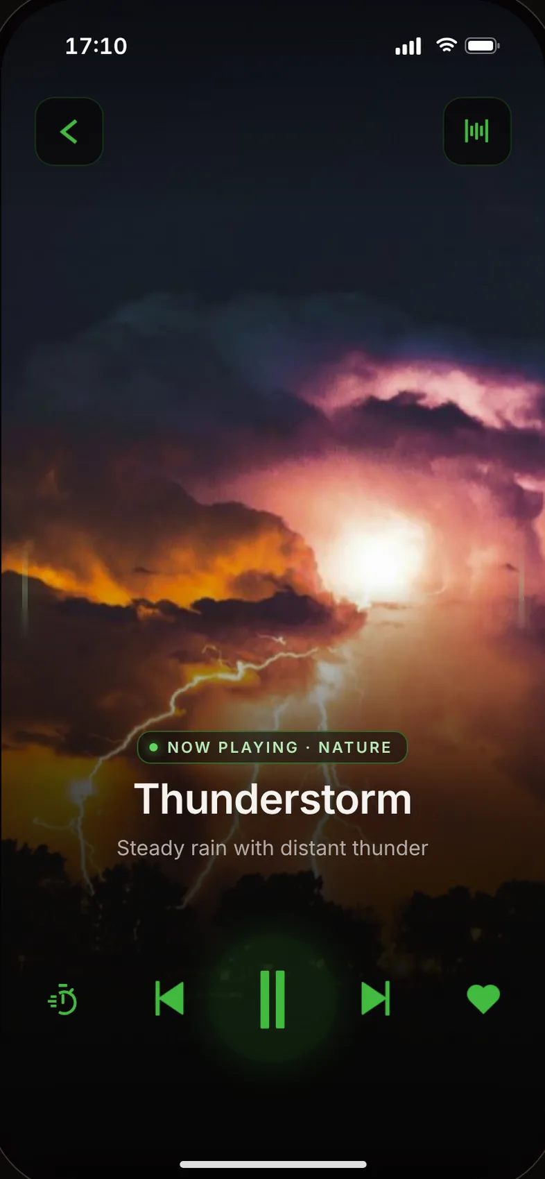
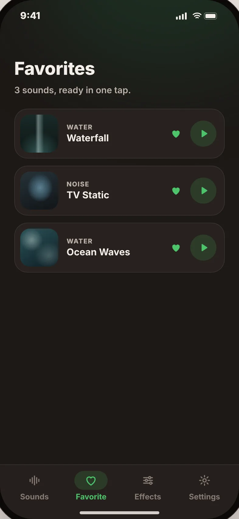
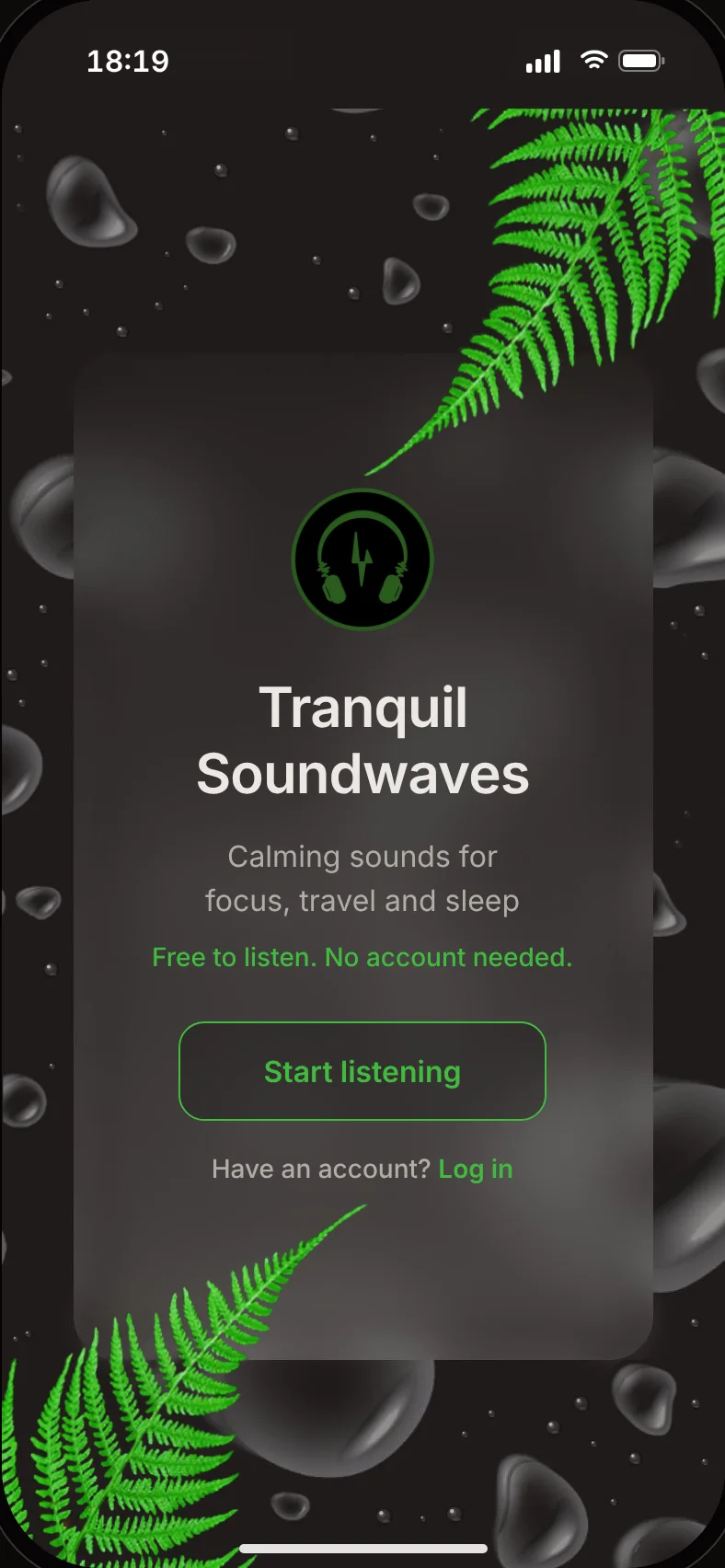
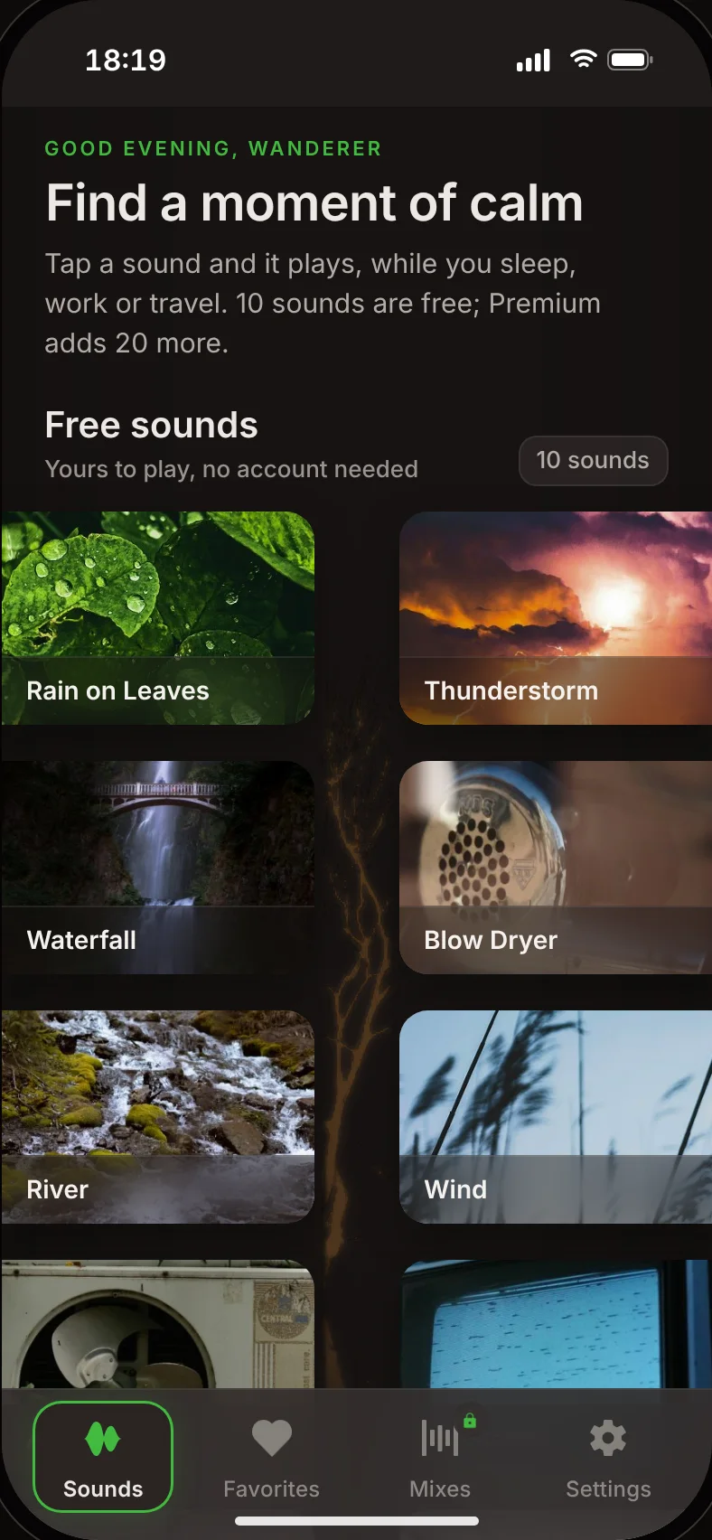
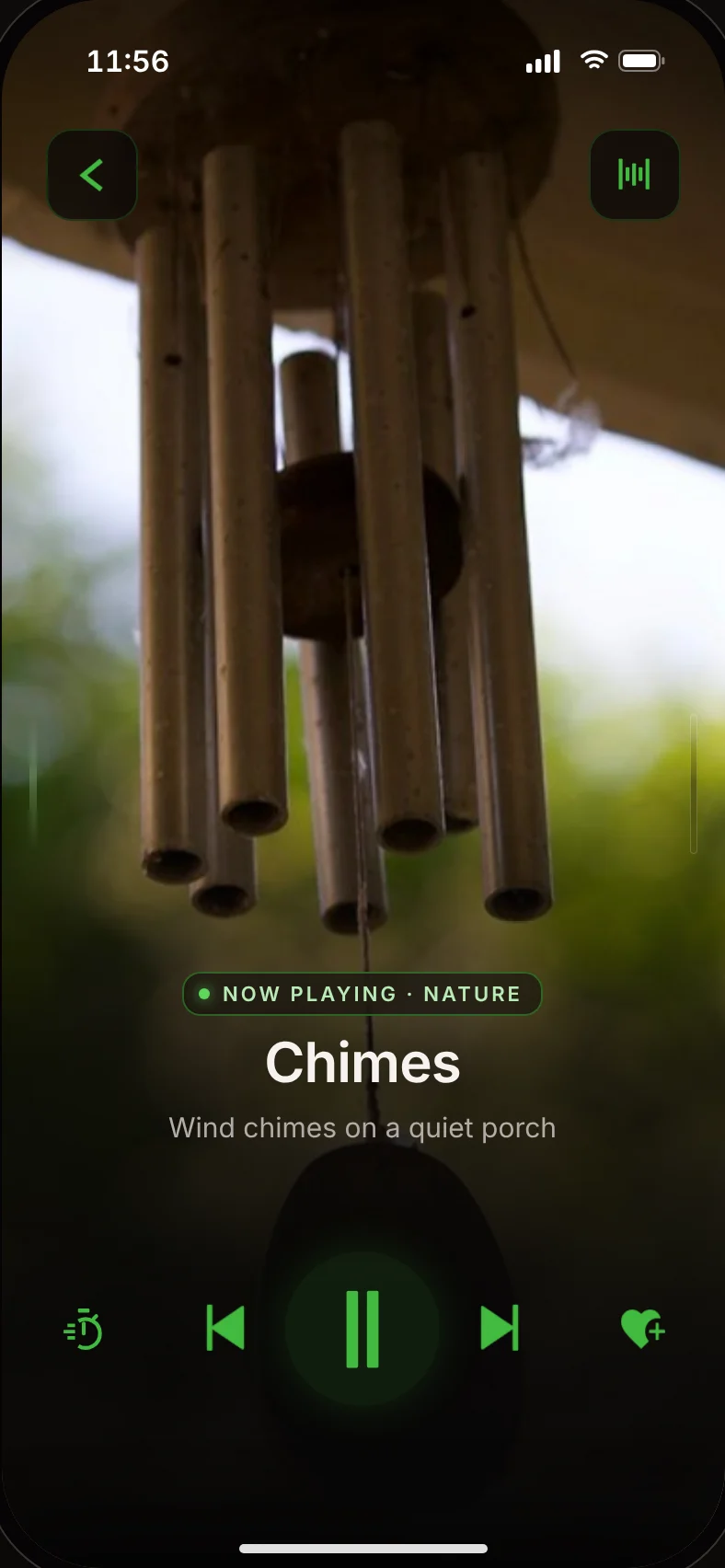
The 2026 app: core screens.

Home
  1. Problem

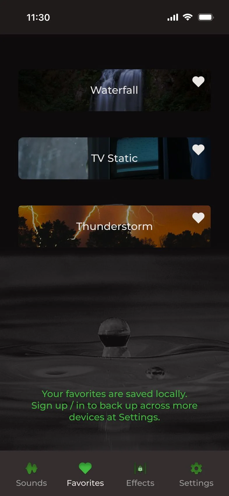
    The 2025 app was fast, sound in about 5 seconds, but it looked like a first project.

  2. My part

    2025 solo. 2026 with AI assisting every screen. Direction, decisions and testing mine.

  3. Key decision

    Refine, don't redesign: keep the identity and the speed, fix the rest.

  4. Result

    A finished app: a clearer player, mixing, accounts and Premium. 3 testers, 20+ changes from testing.

2025 → 2026 refresh

Same app. A year of changes.

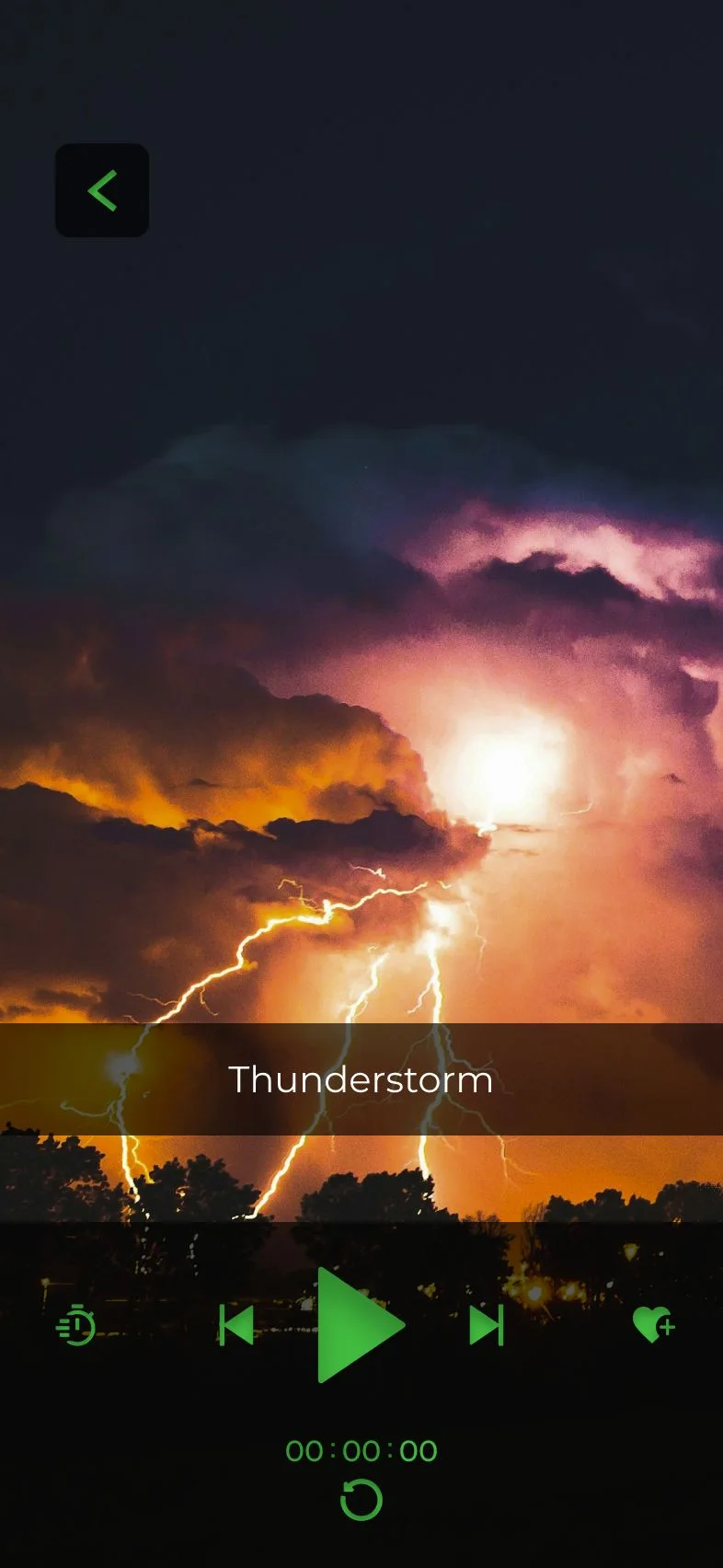
Designed in Figma in about four weeks. It already did the hard part: a first sound in about 5 seconds. In my 2025 tests with users, popular sound apps took 25 to 45. What it lacked was polish.

Key decisions

Four decisions, and every version before them.

Use the arrows or drag through. Each one shows what shipped. Click to see the tries before it.Swipe through. Each one shows what shipped. Tap to see the tries before it.

01Player

Three layouts to land back on one row.

The 2025 order was right. What needed work was the hierarchy.

Layout
  1. Try 1

    Heart moved to the top. Out of thumb reach.

  2. Try 2

    Timer and heart on a second row. It broke a layout people already knew.

  3. Shipped

    One row, the 2025 order. Play is largest, timer and heart smallest, all under the thumb.

Timer
  1. Try 1

    Countdown and stop time on one long line. Hard to read at a glance.

  2. Try 2

    Countdown in its own pill, with a restart button. Testers asked how to turn it off. Nobody restarted.

  3. Try 3

    Hours and minutes only. Seconds came back, as a plain number that doesn't roll.

  4. Shipped

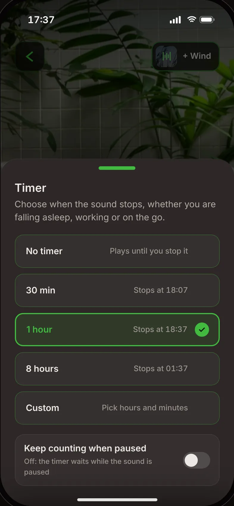
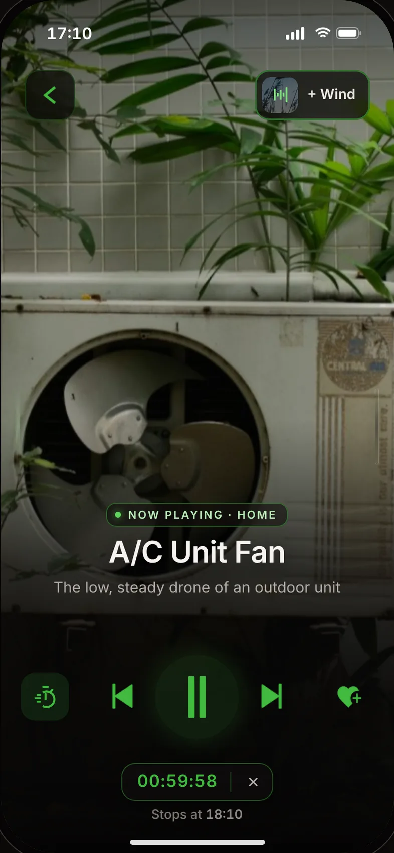
    A one-tap × to turn it off. The timer also waits while the sound is paused.

Timer sheet on A/C Unit Fan: No timer, 30 min, 1 hour (selected), 8 hours, Custom, each with its stop time, and a switch to keep counting when paused
Player playing A/C Unit Fan with Wind mixed in, the 1-hour timer running with an × to turn it off
02Mixing, new

Four versions before mixing felt easier.

2025 promised mixing but never showed how it works.

Mixing
  1. Try 1

    Called "Effects". It sounded like audio filters, not two sounds together.

  2. Try 2

    A chip under the title. The center of the player stacked six things.

  3. Try 3

    A big "Save mix" button. People thought the mix wouldn't play until saved.

  4. Shipped

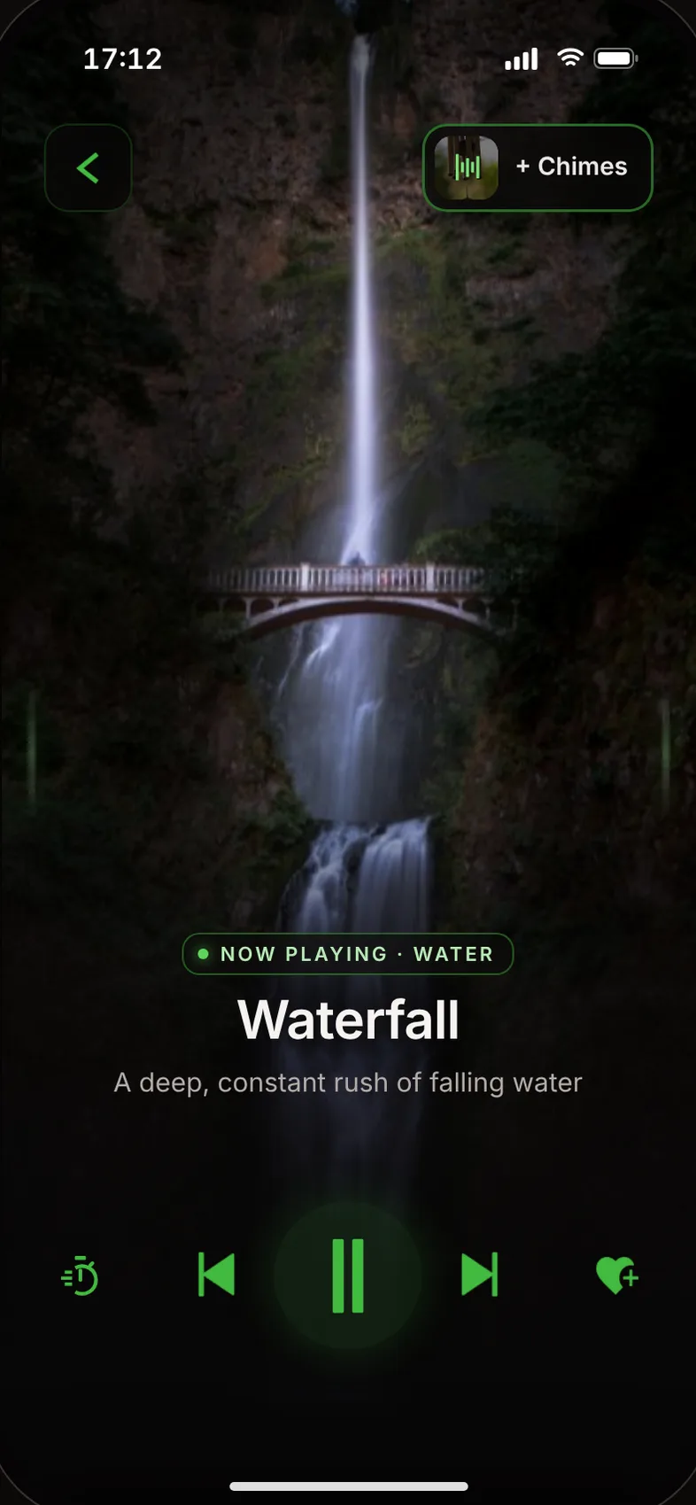
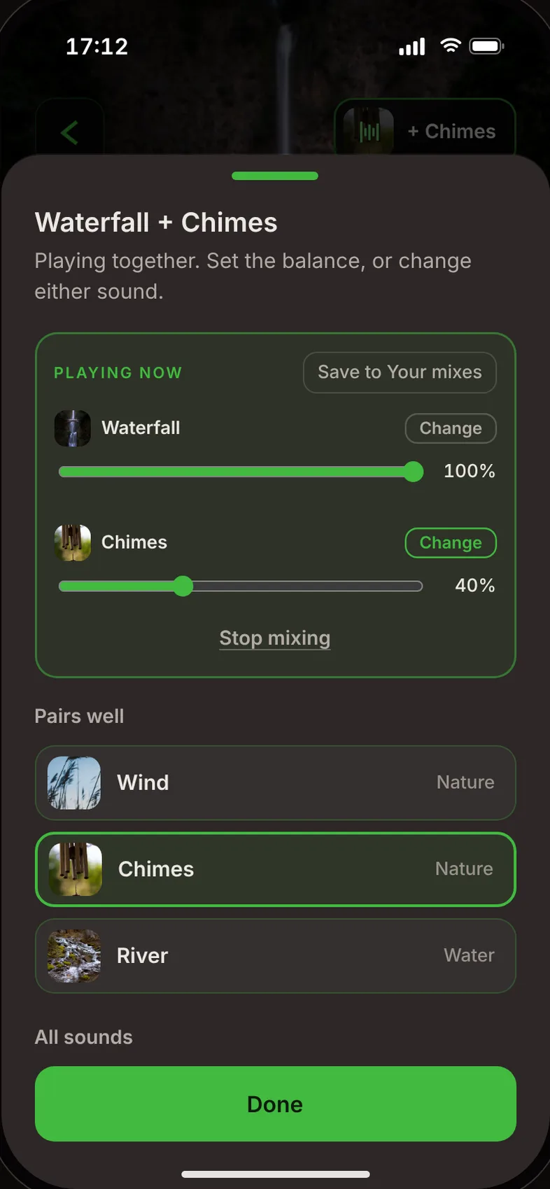
    "Mixes", a corner button that mirrors back. Saving became a small, optional action.

Player playing Waterfall with + Chimes in the corner button
Mix sheet: Waterfall and Chimes playing together, a volume bar for each
03Lists

Designed for today and for two months later.

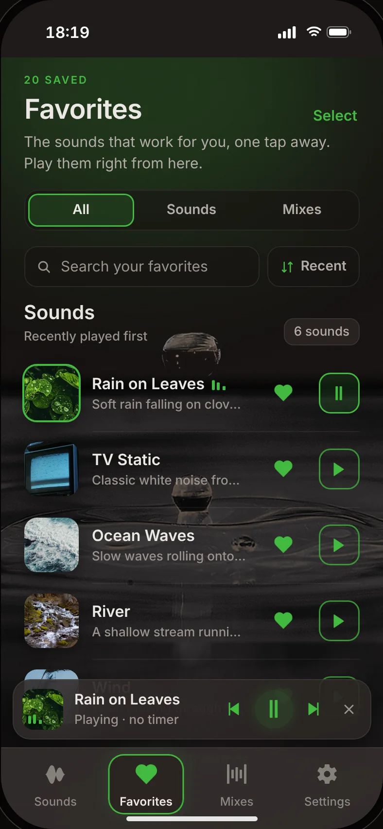
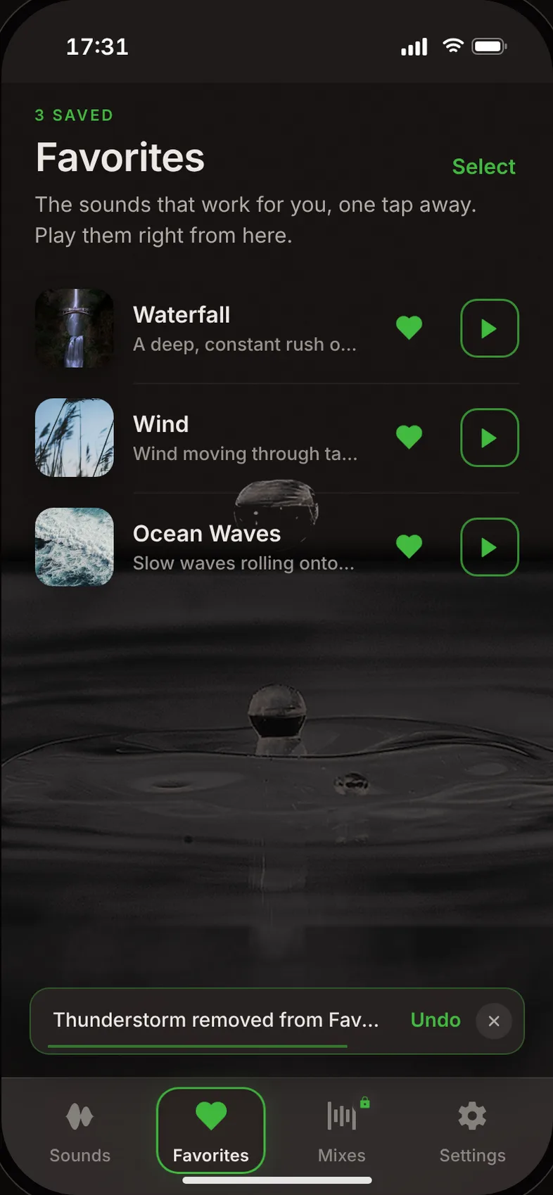
Play straight from Favorites. Every removal can be undone.

Undo
  1. Try 1

    A pop-up for 4.5 seconds, then 3. Both lingered. A mistake is noticed right away.

  2. Try 2

    "3 removed · Undo all". A tester expected one undo per sound.

  3. Shipped

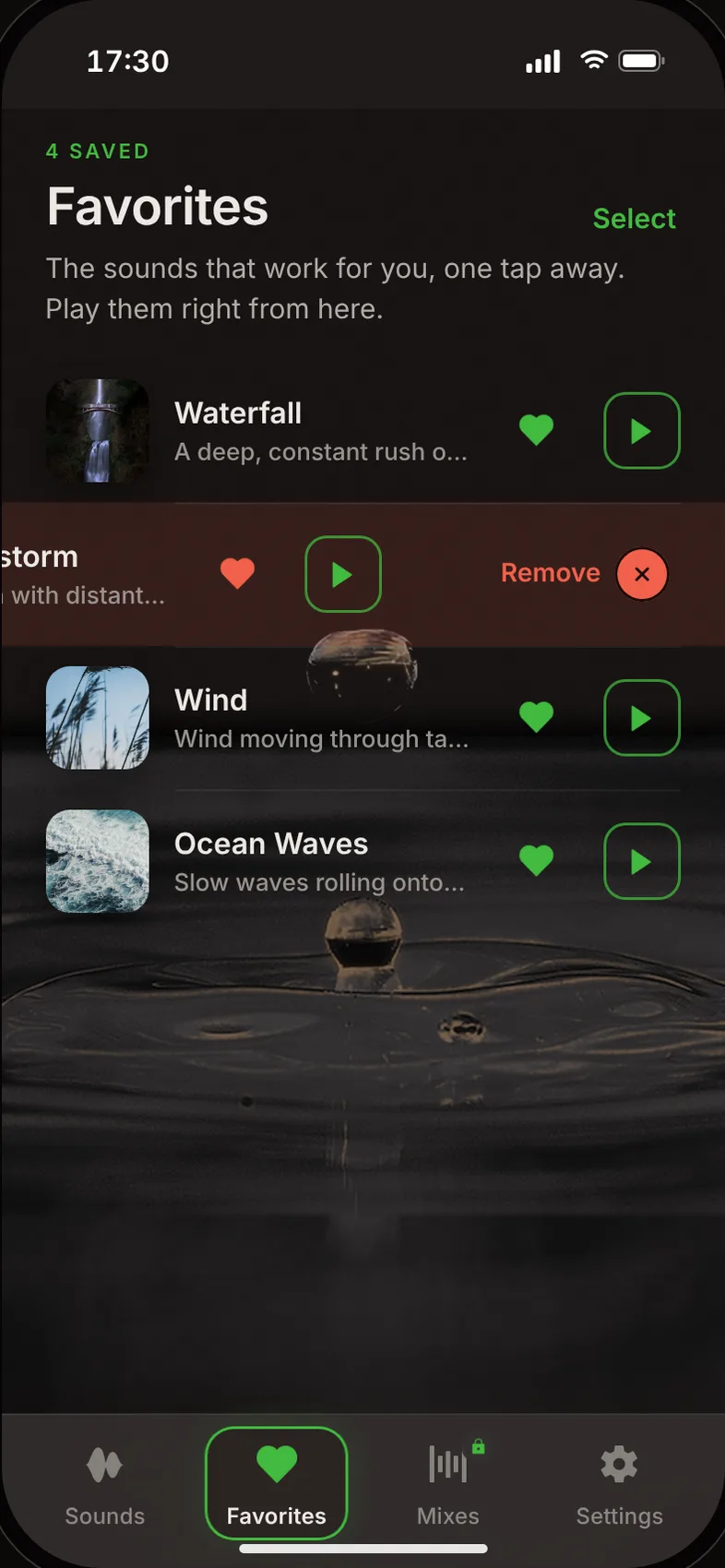
    One small undo per removal, stacked.

Long lists
  1. Try 1

    Filter chips for every sound. With more sounds, they never fit on one line.

  2. Try 2

    "Show 5 more", again and again. Extra taps for nothing.

  3. Shipped

    Five type filters, search, sort, "View all". All hidden until the list grows. With three favorites, they would make a calm app feel like a file manager.

Favorites: a row swiped left turns red and shows Remove
Favorites after the swipe: the row is gone and a message offers Undo
04Premium

A paywall that never pushes.

Easy to find, never forced.

Premium
  1. Try 1

    A locked sound opened the Premium page. It felt pushy.

  2. Try 2

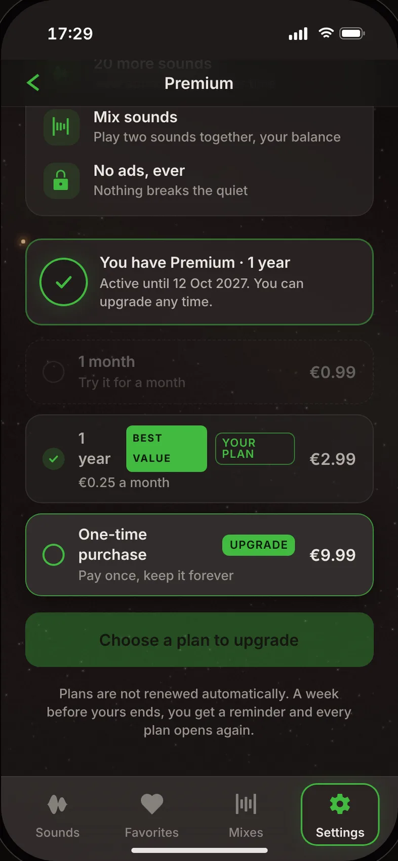
    The plan you owned looked selected. The plan you could buy looked switched off.

  3. Shipped

    Locked sounds stay calm, and three plan states. A tap says where Premium lives instead of opening a sales page. A tester asked to get there in one tap, so “Settings” in that message is a link. Owned, lower and upgradeable plans each look different.

Payment
  1. Try 1

    Only the card form was built. Apple Pay and PayPal jumped straight to success.

  2. Try 2

    Payment methods as a list. Hard to scan at the moment it matters.

  3. Try 3

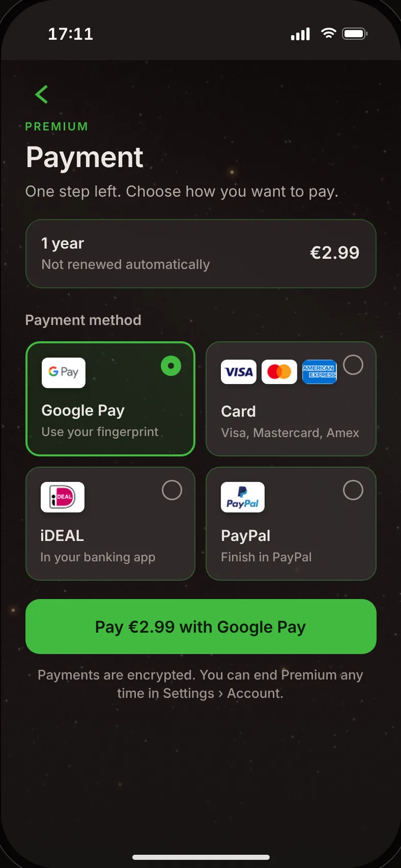
    Apple Pay on every phone. It doesn't exist on Android.

  4. Shipped

    The phone's own wallet first. Google Pay on Android, Apple Pay on iPhone, then card, iDEAL and PayPal.

Premium when you own a plan: your plan with a check, the lower plan faded, the upgrade highlighted
Android payment: Google Pay, Card, iDEAL and PayPal as four cards
01 / 04
Smaller calls5 mistakes, choices and things left out on purpose
  • MistakeThe refresh added a 00:00:00 timer readout.

    The 2025 design left it out on purpose: a timer that isn't running has no point. Now nothing shows until a timer runs.

  • MistakeLog in greeted everyone with "Welcome back".

    It assumed everyone had been here before. Now it says "Ready to unwind?", for new and returning people.

  • Said noNo free trial.

    The free sounds are the trial.

  • CallTimer, not "Sleep timer".

    People listen while they work, travel or sit on the metro, not only in bed.

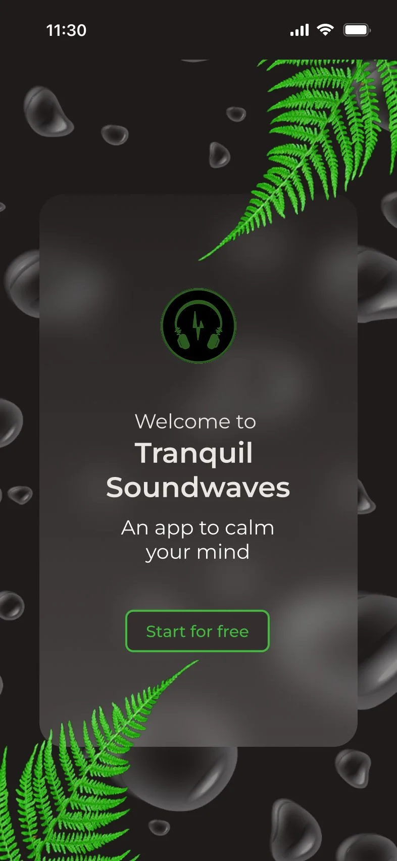
  • Said noThe logo stays a logo.

    A tester tapped it, expecting a button. A second "Start" would mean two buttons for one action.

Usability testing

Three people tested it. Everything fixed the same week.

“Simplicity”

Tester 3, the app in one word
Tester 3The sharpest test

13 things found, from a mix player that could only change one sound to an app that restarted itself.

Found"Undo all" after removing three sounds. He expected one undo per sound.

ChangedOne small undo per removal, stacked.

FoundThe Premium plans looked alike, and "Lifetime" sounded odd.

ChangedOwned, lower and upgradeable plans look different. "One-time purchase".

FoundHe wanted to swipe favorites, pop-ups and the mini player away. "I like swiping, it's easier."

ChangedLists, pop-ups and the mini player swipe away. Buttons stay for people who don't swipe.
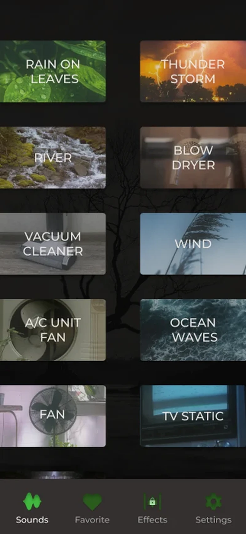
Decisions 03 and 04 came from this test ↑
Tester 1

FoundFavorites showed sounds a new user never saved.

ChangedIt now starts empty.

Tester 2

FoundSaving a second mix replaced the first, without a word.

ChangedEvery mix is saved on its own.Losing something without warning makes people stop trusting Save.

"I can't say it was difficult to use. Easy navigation through the app."Tester 2
Before and after, 2025 → 2026

A fully working app.

Drag the screen to compare 2025 and 2026. Every screen works in the prototype, with real sounds.

2025 → 2026
2026 version
2025 version
2025 · original2026 · refresh
Motion

Calm colours, but not boring.

In 2025, 8 of 11 screens didn't move at all. Now every motion means something.

Onboarding

The logo opens into the welcome card.

Play

Browse the cards, open a sound, pause it.

Favorites and Mixes

Favorites, then making a mix.

Your plan

Your plan, then an upgrade.

Recorded from the working prototype.

Accessibility and system

Built to be read at night.

  • 8:1contrast on Delete account, the highest level (AAA)
  • 44 pttap areas on small links, Apple's minimum
  • Manropereplaced Montserrat, at lighter weights
  • 14 pxone corner radius for every button. Only play stays round
Accessibility and system detailsThree more checks, icons and colour
  • The lightest gray text was made brighter for low screen brightness.
  • Errors appear under the field, not in pop-ups.
  • "Now playing" sits in a dark tag, readable on every photo.
Icons

The 2025 shapes, redrawn flat.

Colour

The 2025 palette plus one warm error red.

How it was made

2025 in Figma. 2026 with Claude.

The 2026 refresh was made in conversation with Claude, as a working prototype with real sounds.

The first lesson

The first AI pass changed the design. The feeling was gone.

It ran before there was any direction: new icons, a new intro, a different mood. So the refresh went back to the 2025 design and kept only the AI parts that worked.

AI can make a clean screen in seconds. Without direction, it can't know how the app should feel.The lesson
See the AI pass ↑
The habit

Every decision and its reason went into a decision log: more than 50 entries, from the font to the payment screen.

Outcome

A year later, the best decisions were the ones kept.

The 2025 version had the right idea. The 2026 refresh kept the idea and the identity, and finished everything around it.