Hirely
A social feed for jobs, where job seekers and employers meet through video.
See it work- Role
- UX and product designer
- Team
- CEO and lead on feedback, developers on the final UI
- Timeline
- 4 months, June to September
- Tools
- Claude as the design partner, and Figma
- Platforms
- Mobile app and web app, dark and light
- Status
- In development
Design work by me, made at Capisoft. All rights belong to Capisoft.
Job seeker
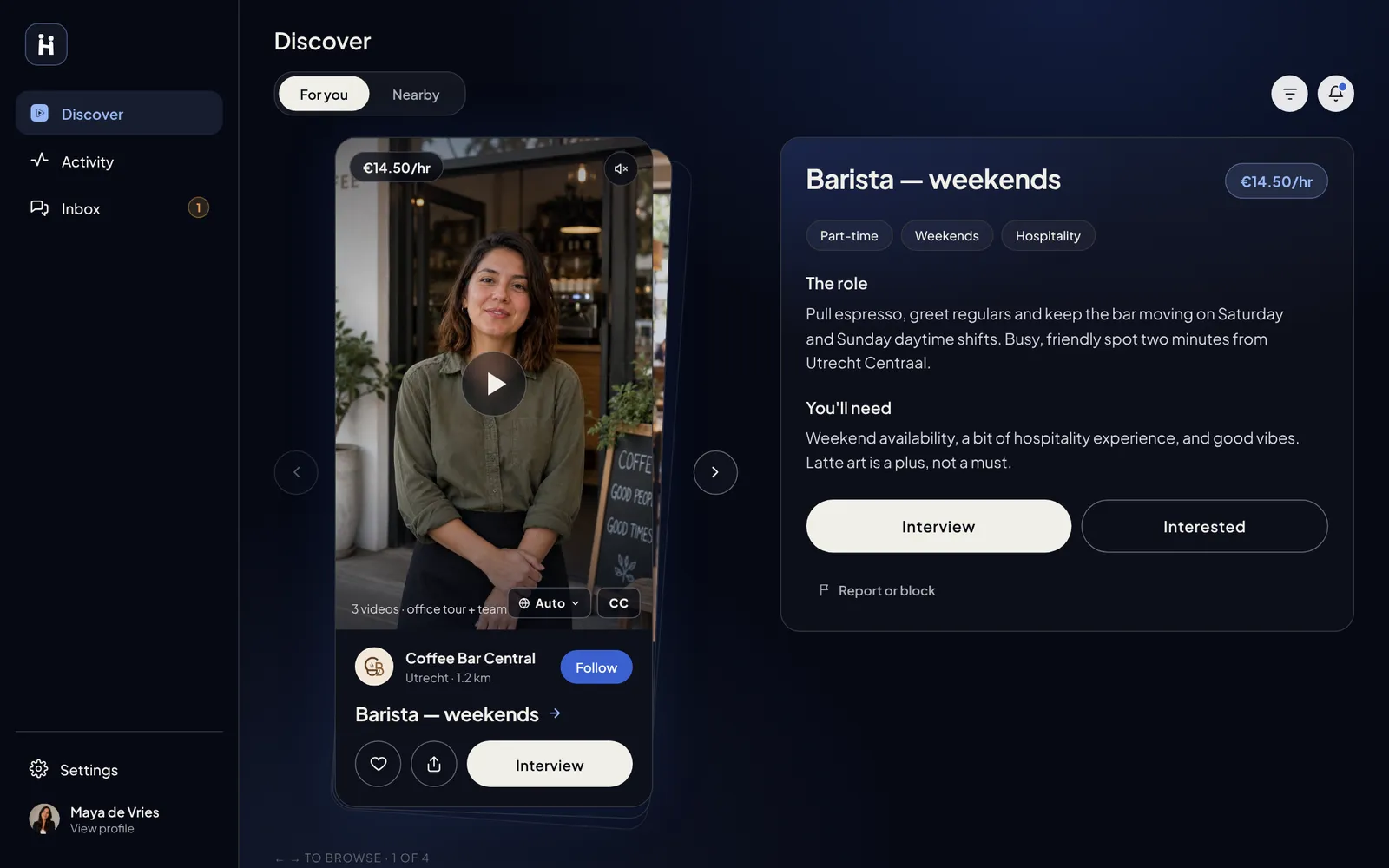
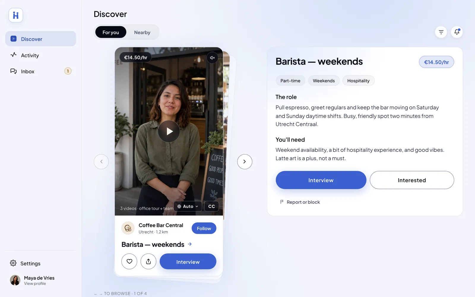
Discover · dark mode
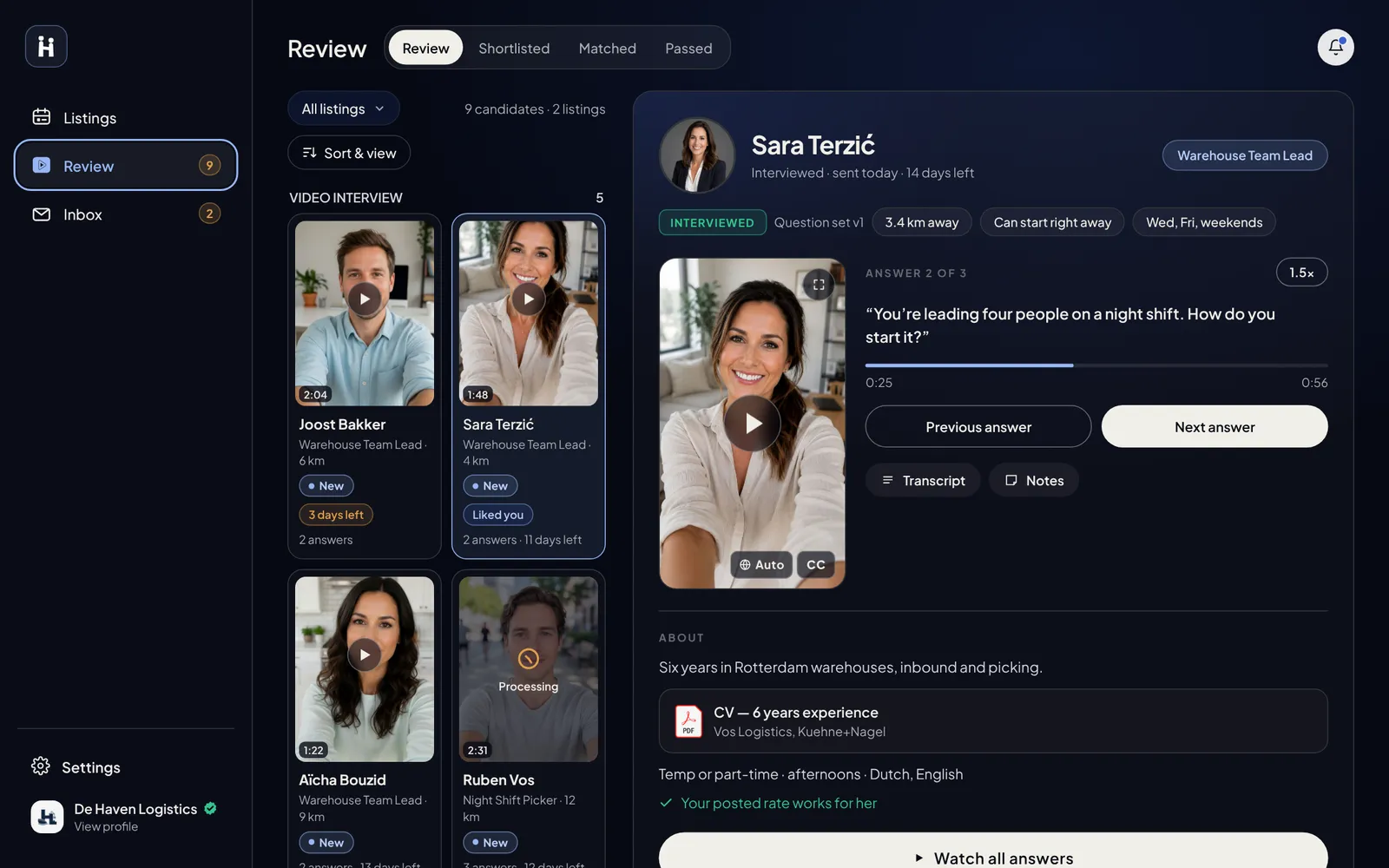
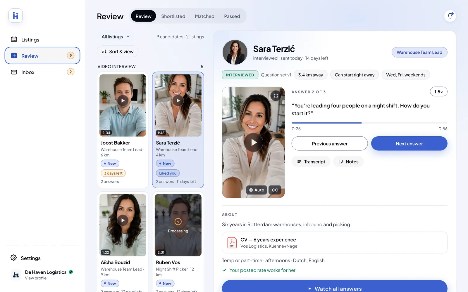
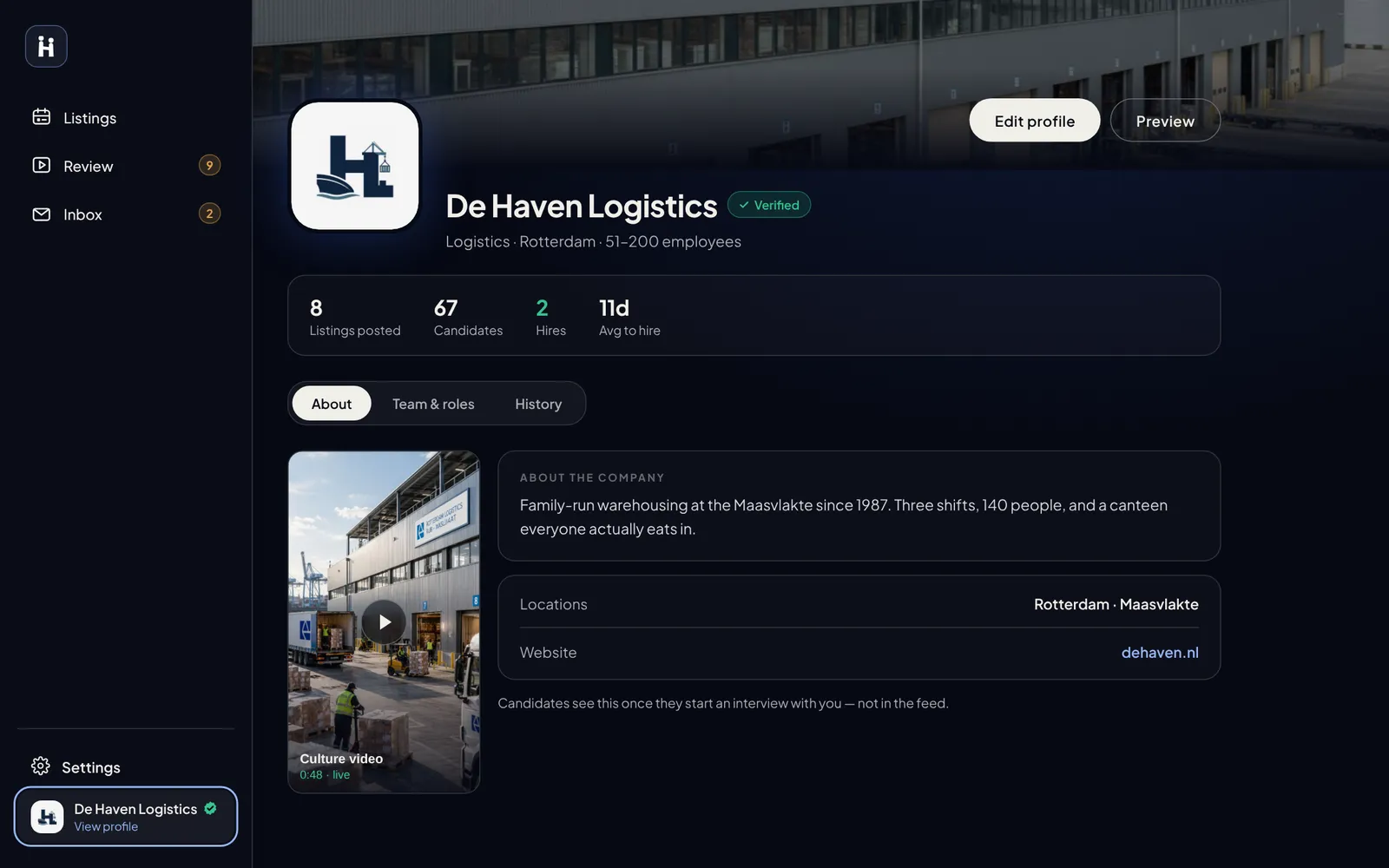
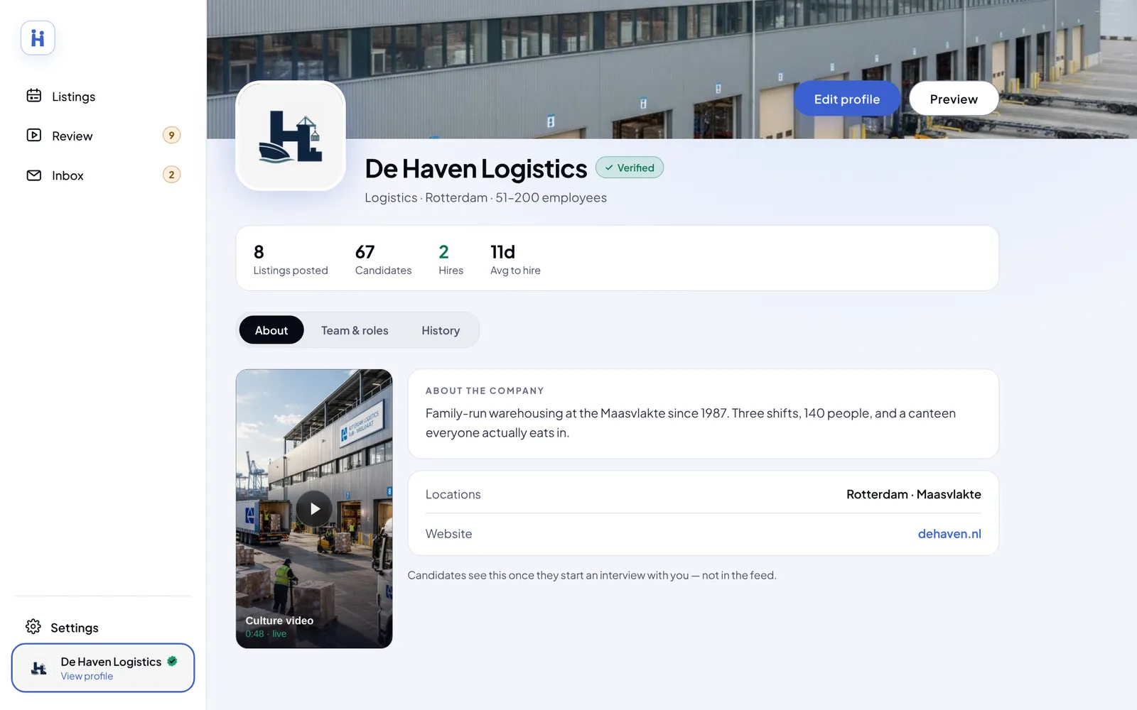
- Problem
Job hunting is slow and text-heavy. 46% of job seekers have given up on an application that was too tedious.
- My part
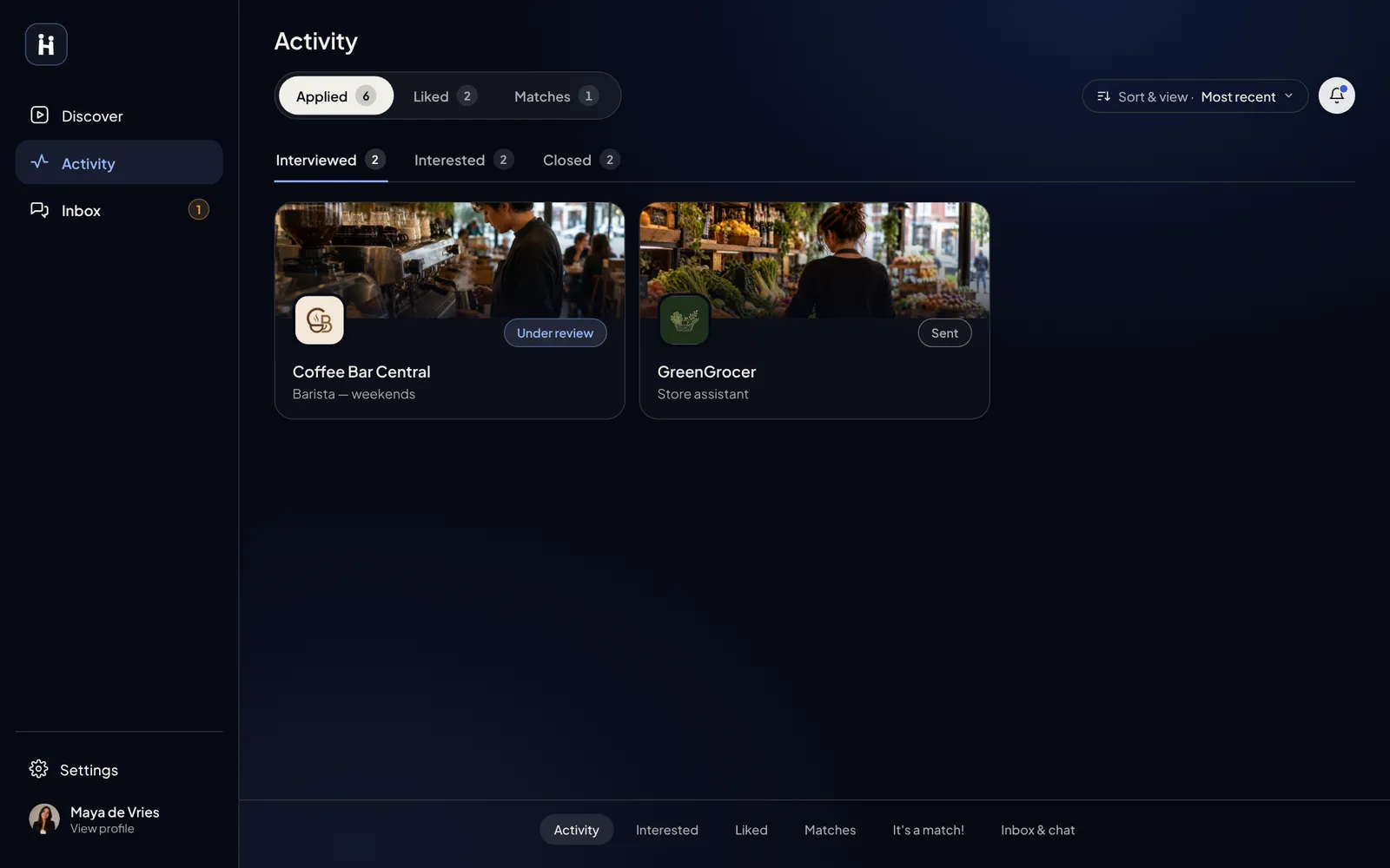
The information architecture, both user paths, the design system, dark and light mode. See how it was made ↓
- Key decision
One app, two paths that meet at the match.
- Result
Delivered the designs. The developers built on the design system.
Job hunting is slow and text-heavy. What if it felt like scrolling?
The idea came from Capisoft: a job platform that works like LinkedIn meets Instagram, with short videos and a feed for both sides of the market. The brief: make it a full app.
46%of job seekers have given up on an application because it was too tedious or took too long. Indeed, State of the Job Seeker survey · 2026 ↗
Read the full briefWhere it started and what was missing
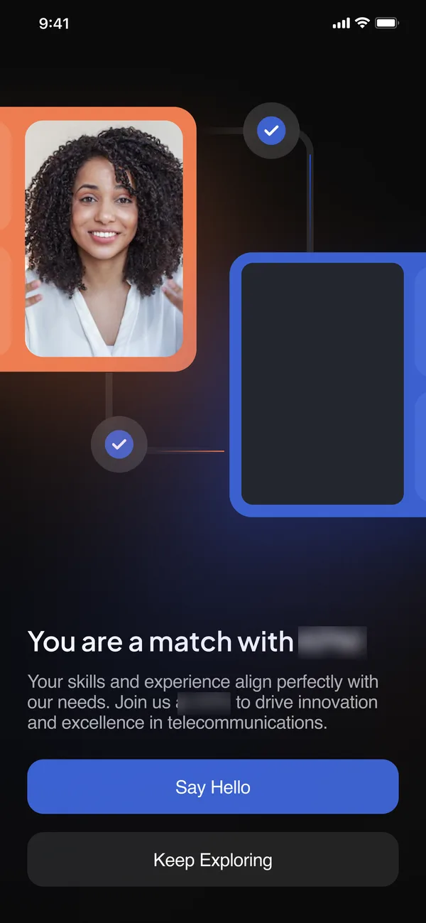
Capisoft pitched the idea to the client as 5 concept screens, all for the job seeker. Only the splash survived. There was no employer side at all, so it was designed from zero, together with the flows, the structure and the design system. The CEO set the vision, my lead designer gave feedback, and the developers are now building it.
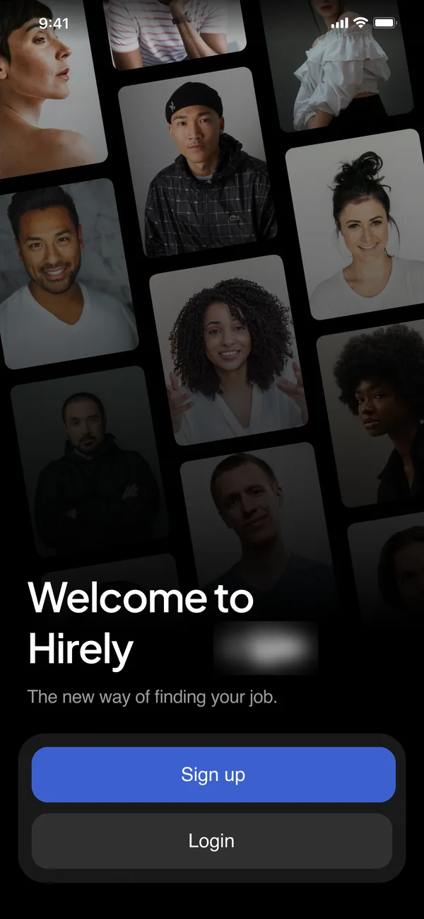
The people collage and the welcome line stayed. The buttons changed: Sign up and Log in became a choice between looking for work and hiring.
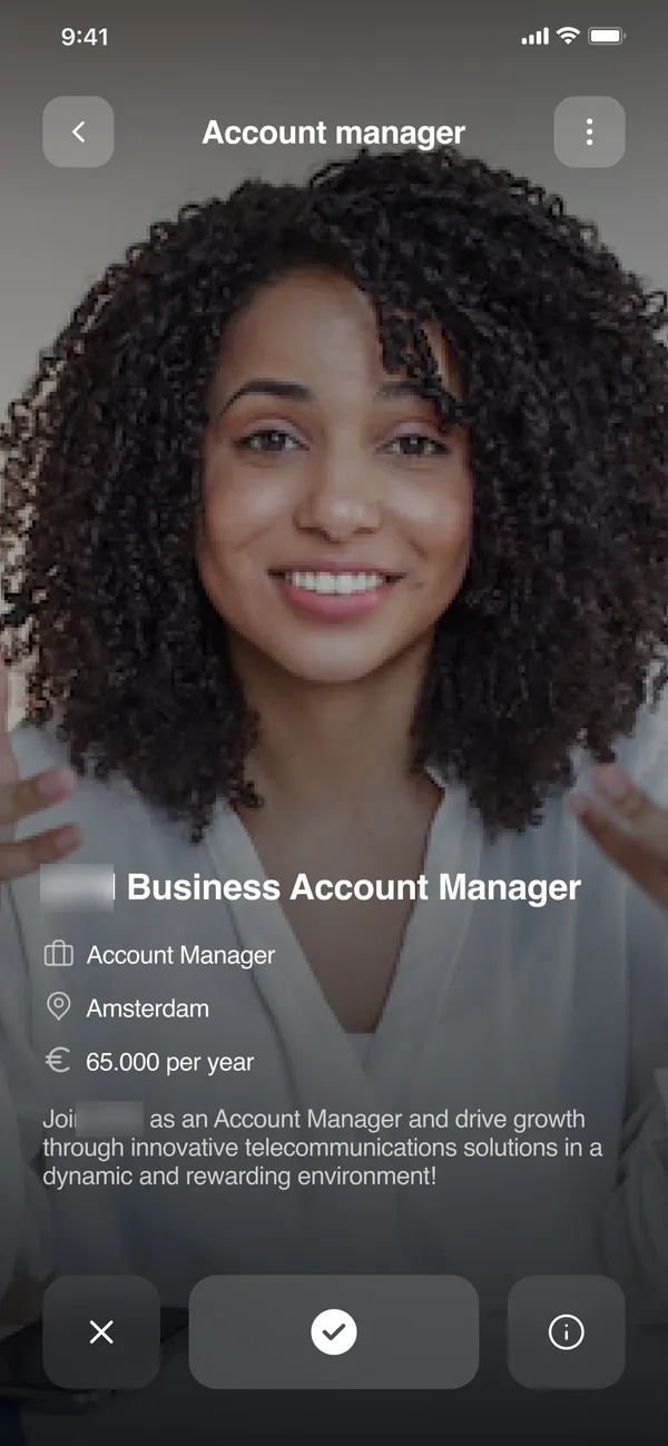
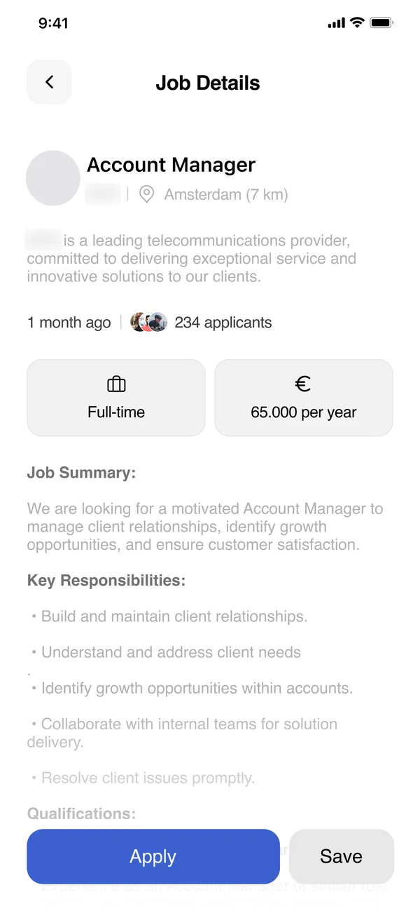
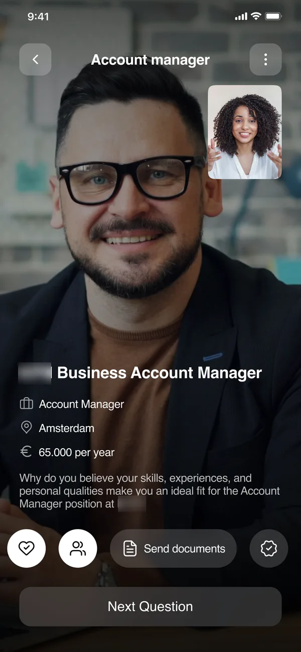
Watch the happy path. Then try to break it.
Employer onboarding, from "I am hiring" to a verified account, in the web prototype. Want to see the full prototype? I'll show it in person.
Most of the app is what happens off the happy path.
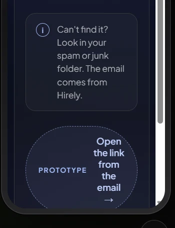
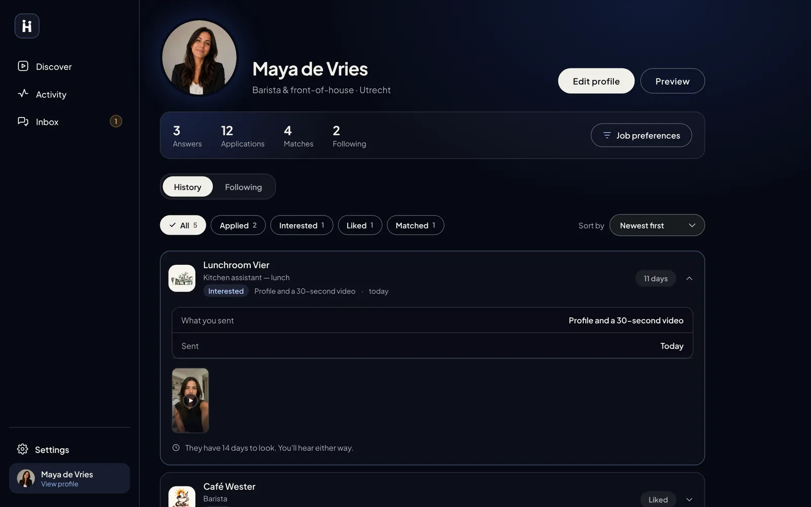
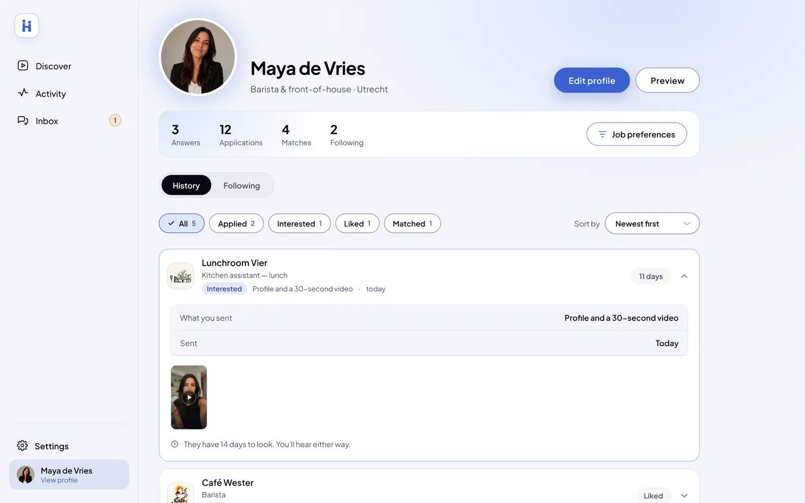
Error, loading and empty states, and every route in and out, on both sides. Pick a situation and try it in the web prototype. Stuck for a moment? A hint lights up.
You forgot your password. Get back in.
You’re on a shared computer. Log out without being remembered, then log back in as a job seeker.
He’s not the right fit for this shift. Pass on him and tell him why.
Claude drafted the first map. I fixed its logic.
The information architecture and first screens, drafted from the pitch deck and my notes. Once its logic was fixed, it became the reference for every screen.
Many screens had no connection to the next, and login states were missing. The gaps were filled with my own logic, then refined in Figma.
View the full processCEO feedback and who led each step
He described his vision in a few words. Together we went through the scenarios, like how an employer uploads or records a video and how a job seeker swipes, and picked the best one. Some additions were his, like importing listings from other job platforms.
- 01ConceptCapisoft
- 02Mobile appMe
- 03New UIDevelopers
- 04Web appMe
Claude drafted the screen. I refined it in Figma.
Job seeker profile settings, before and after. Point at a number, or click it, to see what changed.Tap a number to see what changed.
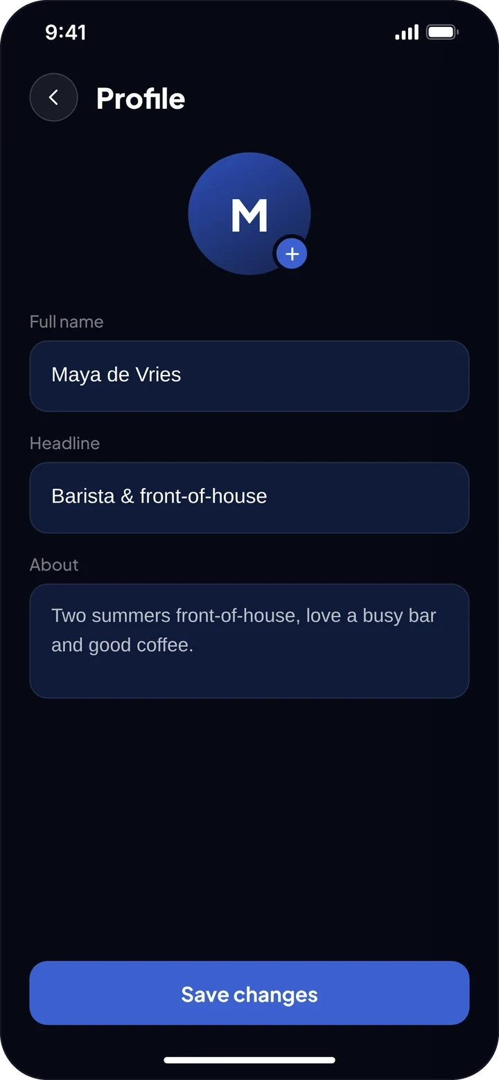
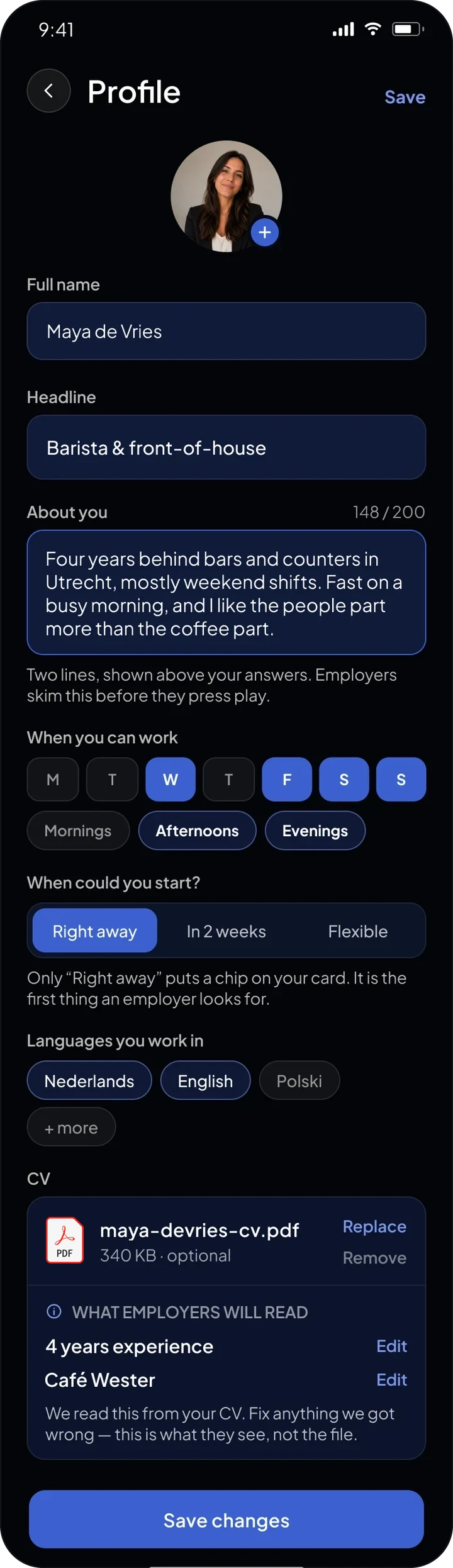
First screens generated with Claude. Photo placement, colour, text size and weight, layout, new fields and the light mode done by hand in Figma.
One app, two user paths. They meet at the match.
After the splash, one choice: "I'm looking for work" or "I'm hiring". From there, each side sees only its own tools.
- 01
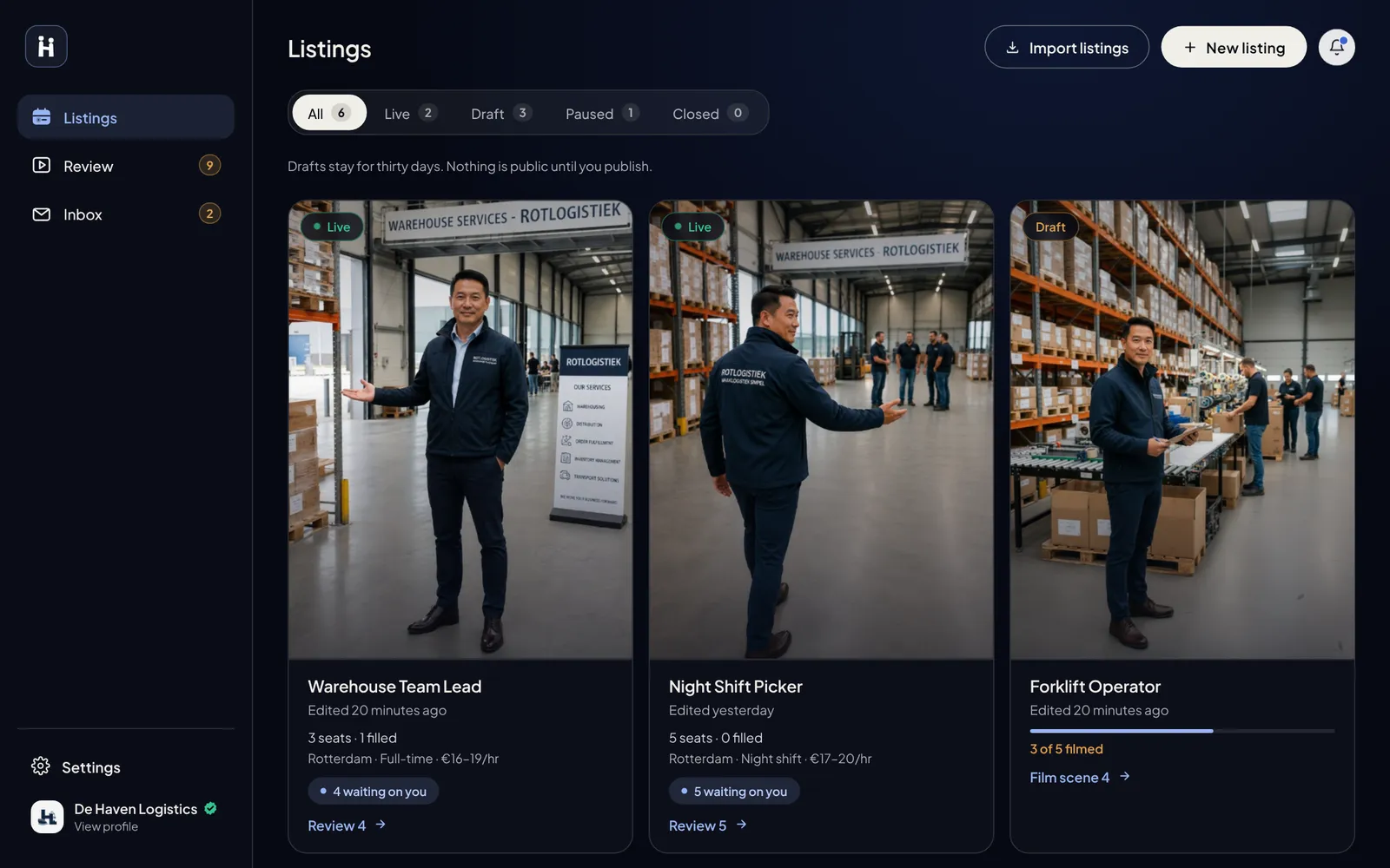
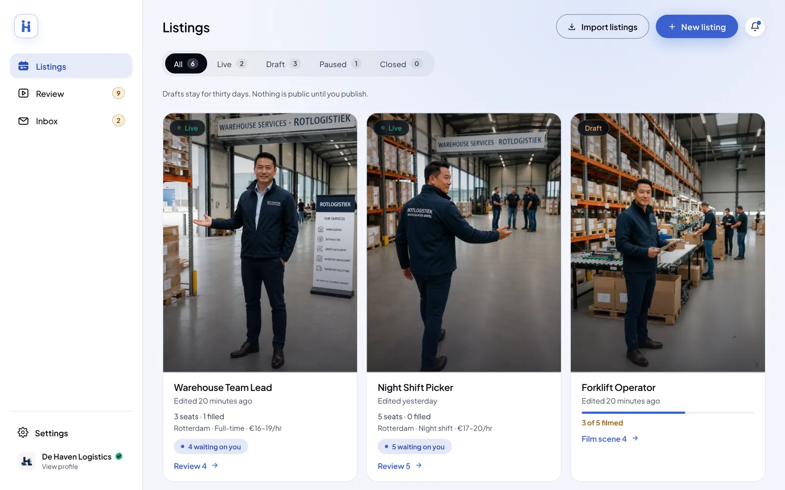
The employer path carries the load
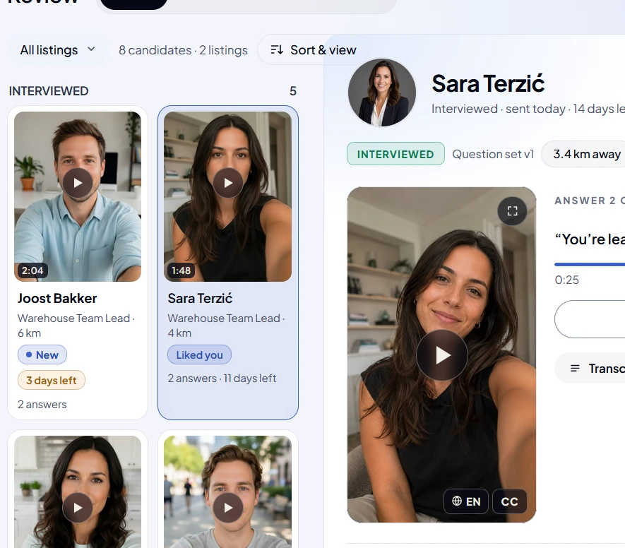
A listing, an intro video and interview questions, then reviewing candidate videos, messages and matching. Plus the subscription and inviting colleagues.
WhyEmployers range from Gen Z to older people. The design stays modern but familiar, with guides at every hard step.
Two more decisionsRecord, upload or write. Left out, for now
- 02
Record, upload or write
First version: recording only, an introduction and then 3–5 interview questions. The team suggested uploading too. Job seekers who don't want to record can write their answers instead.
WhyNot everyone is comfortable on camera. Video stays the strongest choice, but never the only one.
Trade-offA written answer is easier, but shows less of the person, and that is what employers come for. Uploads meant one video format had to work in the web app too.
- 03Left out, for now
A separate admin flow
Colleagues join the employer's account through an invite link, with limited actions. Accepted by the team.
Trade-offFull role management, or a simpler product first. Simpler won. Roles can come later.
The UI keeps changing. The main structure stays.
The developers are reworking the mobile UI. The main structure has remained. Between my mobile app and my web app, some pieces stayed exactly the same and a few changed.
StayedMobile and web

#060914Brand blue#3B61D0Success#35C48DMatch#C8563FThe system rulesFour rules every screen follows
RulesFrom the system
- Say helloThe match is the only warm moment.
A white button with a coral label, on the match screen only. Everywhere else stays cool and blue.
- 3 digits to goA disabled button says what's missing.
Not a grey "Continue". The label counts down until the code is complete.
- Every video is 9:16.
The webcam records 16:9. A fixed guide shows what will be kept.
- MatchedUnder reviewDeclinedMatchedUnder reviewDeclinedLight mode isn't inverted.
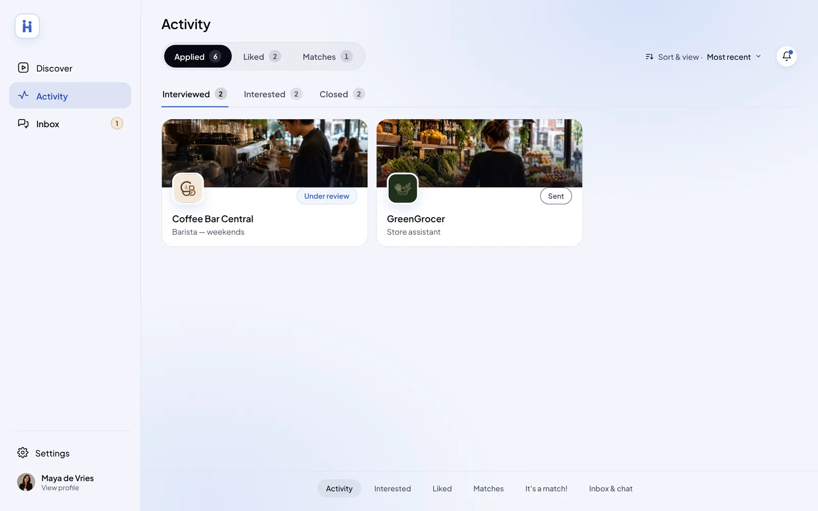
Dark is the default. Light is there for those who prefer it. Blue stays the same, and the status colours got darker versions that stay readable on white.
Show what changedMobile → web: button, navigation, selected tab
ChangedMobile → web
Blue, rounded corners → cream pill. On web, blue moved to the details: links, focus and your own chat bubble.
Bottom tab bar → sidebar. The employer's centre "+" became a "New listing" button.
Blue fill → cream fill. Counts stay as small pills on both.
Delivered the designs. Now being built.
- 4 months
- From a pitch deck to a full app
- 236
- Mobile screens, each one checked by hand
- 2 modes
- Dark and light, on mobile and web
- Handed over
- Figma files and a working web app
The structure, both user paths and most flows. The design system: elements, icons, font and main colour. For the web app: 10 Figma screens per side for the developers to reference, and the full design system in the working build.
Gradients, colours and a few flows in the mobile UI. The web app mixes my system with their new UI.
“Multiple developers asked me: who made the designs of Hirely? They were impressed by how good and clean the flows were. Super clear for them as well. Great work.”
The structure held
The developers reworked the UI. The flows and the information architecture stayed.
Starting from a deck
No flows or structure to start from. Every path mapped from scratch.
Measure it at launch
Test both sides, then track time to a first interview and matches that turn into a chat. Also, let people hide a CV tag the AI got wrong.
You thought AI always gets it right?
Only a few screenshots were saved. The fixes were many more.